Decolonizing the Map
The Equal Earth Projection and the Re-centering of Africa in Global Consciousness

Why Maps Are Political
When I was studying for my international relations master’s program entrance exam, I memorized the world map. When I learned where each country was, its size, its neighbors, and the demographics of its people, everything clicked differently. I began attaching imperial history, colonization, conflict zones, natural resources, and political systems to physical space. A mental map gave me a place to organize global events. It helped me understand the world as a set of contained systems with their own languages, rules, incentives, and norms.
Most people assume maps are objective tools. In daily life, we trust maps because we believe they show us “the world as it is.” In reality, every map is a choice. A projection stretches, compresses, rearranges, and simplifies a spherical Earth onto a flat surface. Each choice alters perception, and perception is very important because it functions as a cognitive shortcut for power, scale, and importance.
Today, we will explore this through the continent of Africa.
The Psychology of Spatial Knowledge
Humans rely heavily on spatial cues to form judgments. Cognitive psychology consistently shows that visual-spatial information shapes belief formation because the brain tends to trust what it sees. Research by Montello (2018) and Tversky (2005) demonstrates that spatial memory influences moral judgments, threat perception, and assessments of importance. When a region looks larger, people assume it matters more. When it looks smaller, they often assume the opposite.
A map projection is the method used to represent a three-dimensional Earth on a two-dimensional surface. No projection is perfect because a sphere cannot be flattened without distortion. Some projections distort shape. Others distort distance. Many distort relative size. These distortions matter because what the eye sees begins to shape the narratives the mind believes.
How Maps Have Been Used for Power
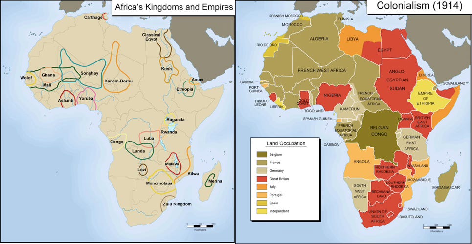
Western maps have long reinforced Western centrality. Colonial cartographers drew borders that divided ethnic groups and merged unrelated communities. This manipulation enabled easier governance and resource extraction under oppressive rule.
Historical examples of cartographic power include:
Berlin Conference Maps (1884–1885): European leaders divided Africa using treaty maps that ignored existing societies. These maps determined extraction rights, trade routes, and future state lines.
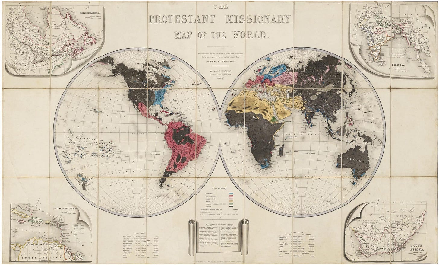
Missionary and Treaty Maps (17th–19th centuries): These maps framed Africa as a spiritual and economic frontier. They justified intervention and reshaped European public opinion.
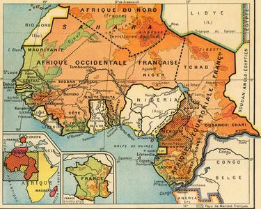
The French Carte d’Afrique Occidentale Française (AOF): This map reduced complex societies into administrative zones for easier control. It functioned as a blueprint for consolidating French rule.


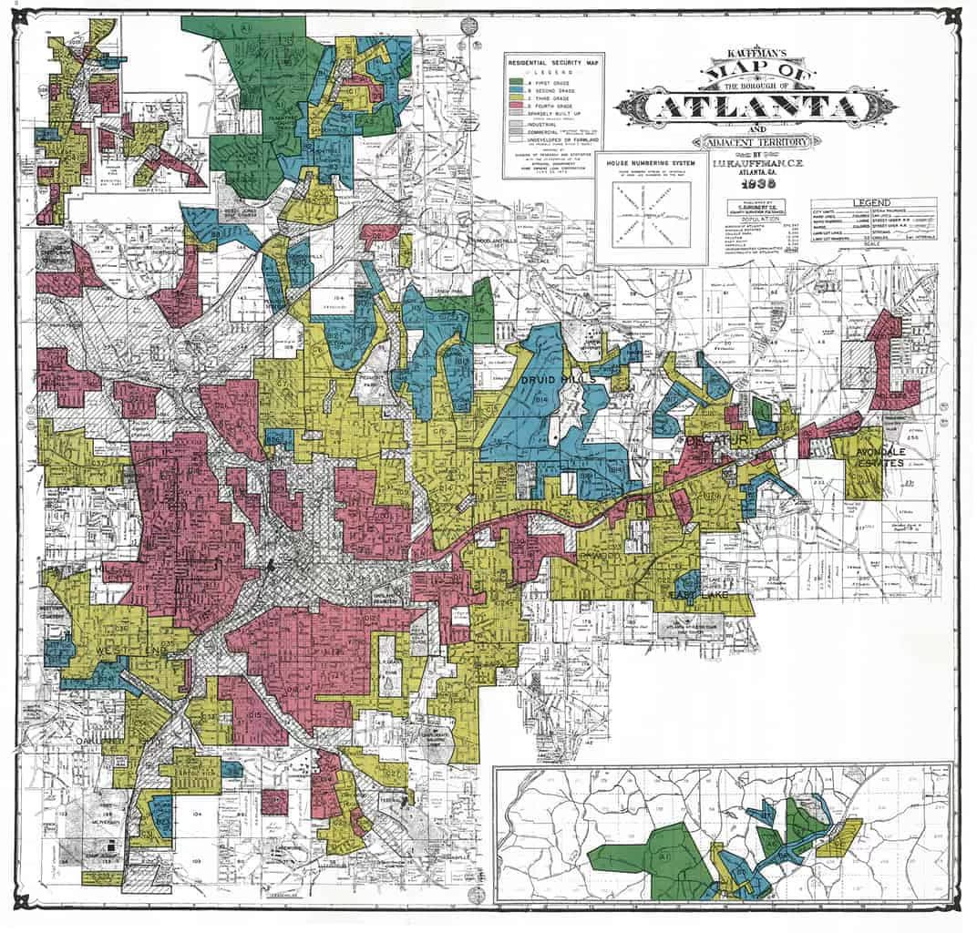
U.S. Redlining Maps (1930s–1960s): A domestic example of racialized cartography that classified Black neighborhoods as “high risk,” restricting access to loans and capital. These were maps designed for segregation.
Maps have always been tools for defining who matters and who does not.
The Mercator Problem
There are many types of map projections and none of them can be perfect because Earth is round while maps are flat. What matters is which projection we choose for which purpose.
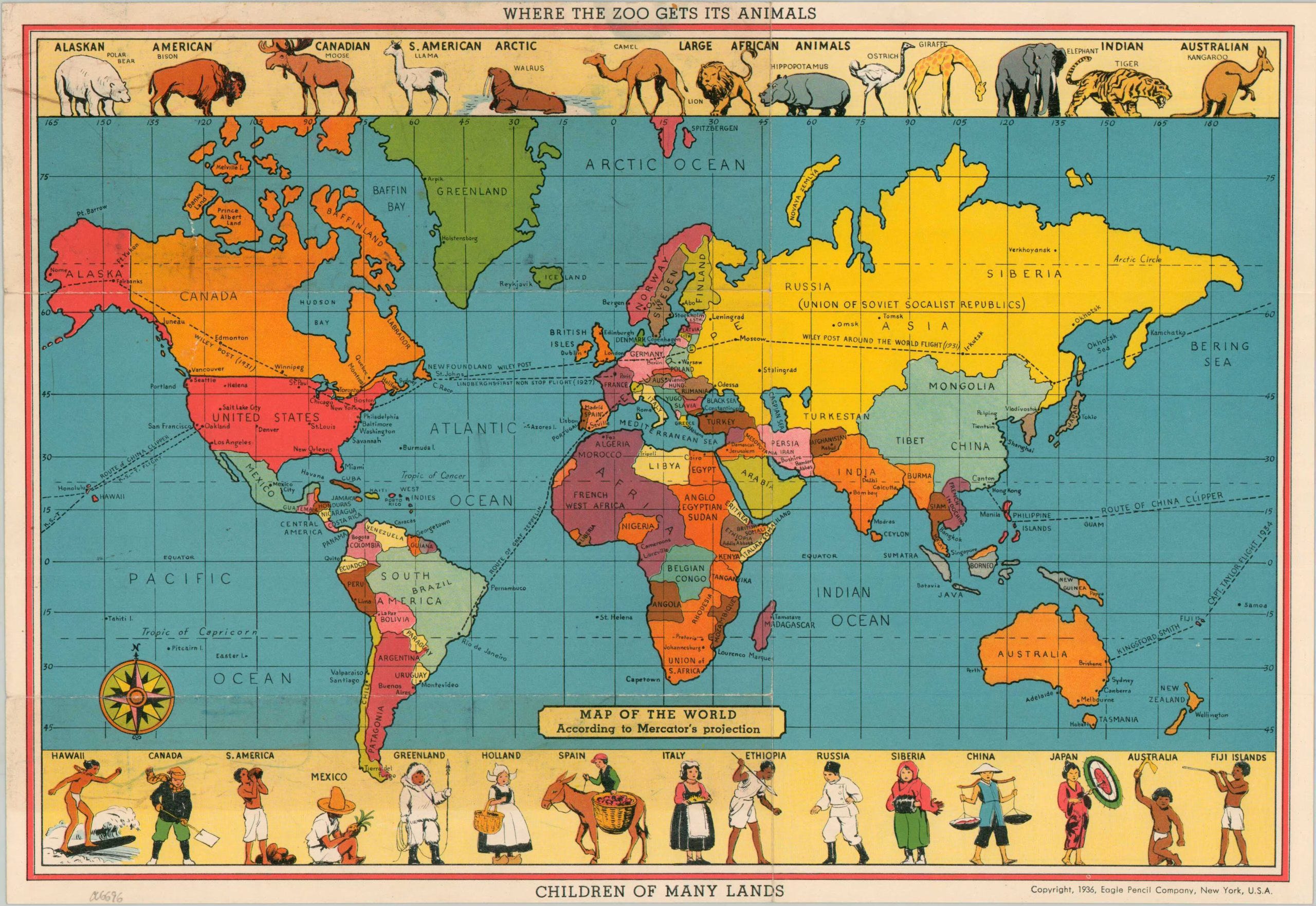
The Mercator projection (1569) was designed for navigation. Its priority was preserving straight-line sailing routes. It was never intended to be a geographic reference for education. Yet the Mercator projection became the standard map in American schools. The average person does not know this is a projection at all. It has become “the world” in the public imagination.
The issue is not that Gerardus Mercator was intentionally racist. The issue is that the continued dominant use of the map privileges Europe and North America at the center of global perception and that is racist.
The Mercator projection significantly enlarges Europe and North America and shrinks Africa and the Global South.
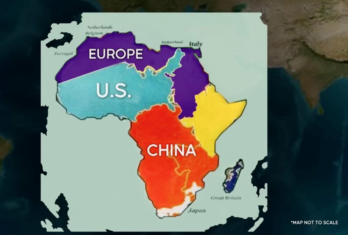
A well-known comparison: Greenland appears larger than Africa even though Africa is fourteen times its size.
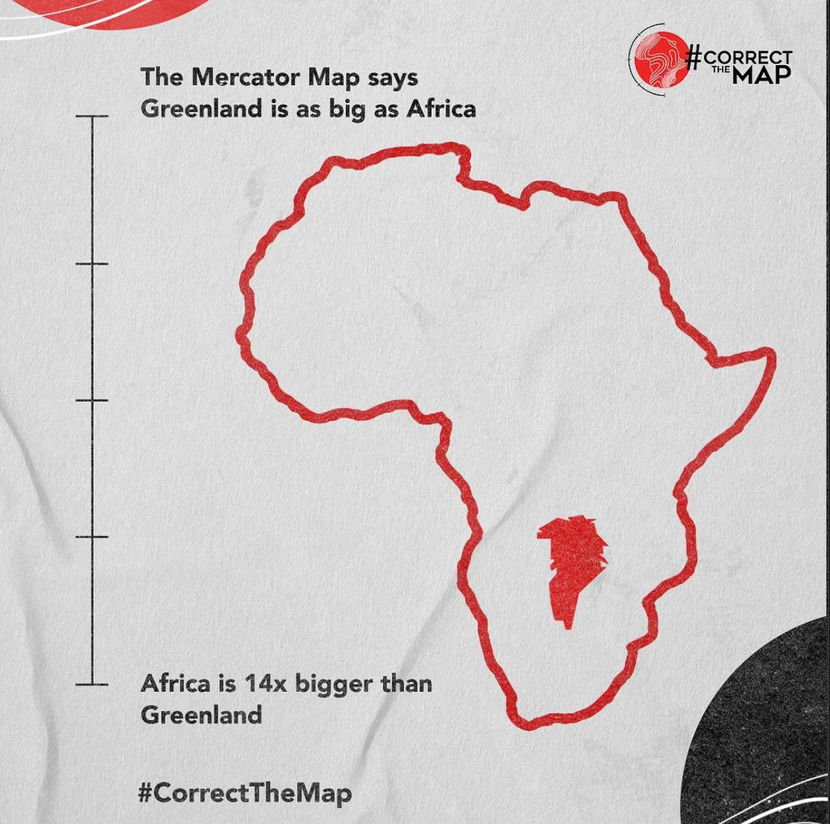
In reality, Africa is so large that you can fit the United States, China, and most of Europe inside it with space left over.
The question is simple. If we know the Mercator projection is inaccurate for size and educational purposes, why do we still use it in classrooms, policy, and international development?
The psychological effect is significant. When children grow up seeing Europe larger than it is and Africa smaller than it is, they internalize distorted hierarchies of importance.
Why Africa’s Size Matters
Landmass influences how people perceive economic importance, military potential, population, and strategic relevance. When Africa is visually minimized, its global contributions and conflicts appear minimized as well. An ecnomist once said that the Mercator map makes Africa look conquerable in the past and irrelevant in the present.
Before industrialization, human beings lived in direct relationship with the Earth. Resource management was tangible and intuitive because people touched the land. Today, new technology distances us from the raw materials that make our lives possible. Phones, cars, batteries, clothes, and power grids rely on minerals and natural resources that often originate in Africa.
Africa’s resource significance:
Africa contains some of the world’s largest reserves of cobalt, rare earth minerals, diamonds, gold, bauxite, copper, and arable land. It is also a global hotspot for biodiversity and critical energy resources.
Scholars such as Päivi Lujala, Philippe Le Billon, and Michael Ross estimate that between 40 and 60 percent of internal conflicts since 1950 have been significantly linked to natural resources. These links include competition, control, scarcity, and financing.
According to UNODC and INTERPOL reports, wildlife crime constitutes roughly 30–40 percent of the revenue streams used by major transnational criminal organizations. These crimes concentrate in biodiversity-rich regions, many of which are in Africa.
When Africa looks small on a map, it becomes harder for global audiences to comprehend the gravity of extraction, theft, and destabilization that have shaped the continent from the Berlin Conference to the present day.
Equal Earth Projection: A Different Story
The Equal Earth projection was introduced in 2018 as a corrective tool for educational equity. It was designed to preserve proportional area so continents appear at their true scale.
It is a pseudocylindrical projection, meaning that the map curves latitude lines to minimize distortion while keeping relative sizes accurate. This matters because it allows viewers to visually understand global relationships without shrinking or inflating particular regions.
African institutions and advocacy groups have taken notice. The #CorrectTheMap campaign, led primarily by Africa No Filter and Speak Up Africa, is the most visible contemporary movement pushing for global adoption of size-accurate world maps. The campaign advocates for replacing the Mercator projection with the Equal Earth projection in schools, media, and policy spaces. Their position is clear. A world that sees Africa accurately is a world better prepared to understand Africa’s economic, strategic, and political weight.
The Equal Earth projection is not just a cartographic option. It is a tool for decolonizing global education.
How to Teach the World Differently
The first step is replacing the Mercator projection in schools, media, and policy spaces with Equal Earth or Gall-Peters, both of which preserve area more accurately.
Major institutions are already shifting.
The World Bank has begun phasing out Mercator-based visualizations.
Google Maps introduced a 3D globe view on desktop that corrects relative size, although the mobile interface still defaults to Mercator.
The key is map literacy. Students should learn:
why map projections differ
what distortions each projection creates
how these distortions shape geopolitical perception
how to question spatial assumptions
Curiosity must become part of global education. Ask:
“Why is this map shaped like this?”
“What system produced this?”
“What story does this tell about the world?”
A Map Is a Story
When the map changes, the story changes.
The Equal Earth projection does more than correct geography. It corrects perception. It recalibrates how students, policymakers, and global citizens understand scale, significance, and power.
Maps shape worldview. If we want a more accurate understanding of Africa’s role in global systems, we must start with what people see first. The world is not flat. Our perceptions should not be either.
Citations (APA)
Berlin Conference / Colonial Cartography
Pakenham, T. (1991). The scramble for Africa: White man’s conquest of the Dark Continent from 1876 to 1912. Random House.
Spatial Cognition and Perception
Montello, D. R. (2018). Spatial cognition and navigation. In D. Richardson et al. (Eds.), The Routledge handbook of cognitive geography (pp. 1–20). Routledge.
Tversky, B. (2005). Functional significance of visuospatial representations. In P. Shah & A. Miyake (Eds.), The Cambridge handbook of visuospatial thinking (pp. 1–34). Cambridge University Press.
Map Projections and the Mercator Critique
Monmonier, M. (1996). How to lie with maps (2nd ed.). University of Chicago Press.
Snyder, J. P. (1993). Flattening the Earth: Two thousand years of map projections. University of Chicago Press.
Equal Earth Projection
Šavrič, B., Patterson, T., & Jenny, B. (2019). The Equal Earth map projection. International Journal of Geographical Information Science, 33(3), 454–465. https://doi.org/10.1080/13658816.2018.1504949
African Union Map Advocacy
African Union. (2020). Agenda 2063: The Africa We Want. African Union Commission.
(Used as a source documenting AU educational and representational initiatives, including spatial representation reforms.)
Natural Resource Conflict Scholarship
Le Billon, P. (2001). The political ecology of war: Natural resources and armed conflicts. Political Geography, 20(5), 561–584.
Lujala, P. (2010). The spoils of nature: Armed civil conflict and rebel access to natural resources. Journal of Peace Research, 47(1), 15–28.
Ross, M. L. (2004). How do natural resources influence civil war? Evidence from thirteen cases. International Organization, 58(1), 35–67.
Wildlife Crime and Organized Crime (UN Data)
United Nations Office on Drugs and Crime. (2020). World wildlife crime report: Trafficking in protected species. United Nations.
INTERPOL. (2018). Global wildlife crime analysis. INTERPOL Environmental Security Programme.
Google Maps and World Bank Map Shifts
Google. (2018). Google Maps introduces a globe view on desktop. Google Press Release.
World Bank. (2021). World Development Indicators: Data visualization policies. World Bank Publications.
(These cite institutional documentation of the shift away from Mercator for global data visualization.)
Redlining Maps
Rothstein, R. (2017). The color of law: A forgotten history of how our government segregated America. Liveright.
(Historical analysis including HOLC maps used for redlining.)